
Note
Go to the end to download the full example code.
Static: Amplitude Envelope Correlation (AEC) Analysis#
In this tutorial we will perform static AEC analysis on source space MEG data. This tutorial covers:
Getting the data
Calculating AEC networks
Getting the data#
We will use resting-state MEG data that has already been source reconstructed. This dataset is:
Parcellated to 38 regions of interest (ROI). The parcellation file used was atlas-Giles_nparc-38_space-MNI_res-8x8x8.nii.gz.
Downsampled to 250 Hz.
Bandpass filtered over the range 1-45 Hz.
Download the dataset#
We will download example data hosted on OSF.
import os
def get_data(name, rename):
os.system(f"osf -p by2tc fetch data/{name}.zip")
os.makedirs(rename, exist_ok=True)
os.system(f"unzip -o {name}.zip -d {rename}")
os.remove(f"{name}.zip")
return f"Data downloaded to: {rename}"
# Download the dataset (approximately 52 MB)
get_data("notts_meguk_giles_5_subjects", rename="source_data")
'Data downloaded to: source_data'
Load the data#
We now load the data into osl-dynamics using the Data class. See the Loading Data tutorial for further details.
from osl_dynamics.data import Data
data = Data("source_data", n_jobs=4)
print(data)
QUEUEING TASKS | Loading files: 0%| | 0/5 [00:00<?, ?it/s]
QUEUEING TASKS | Loading files: 100%|██████████| 5/5 [00:00<00:00, 3338.88it/s]
PROCESSING TASKS | Loading files: 0%| | 0/5 [00:00<?, ?it/s]
PROCESSING TASKS | Loading files: 100%|██████████| 5/5 [00:00<00:00, 595.78it/s]
COLLECTING RESULTS | Loading files: 0%| | 0/5 [00:00<?, ?it/s]
COLLECTING RESULTS | Loading files: 100%|██████████| 5/5 [00:00<00:00, 76260.07it/s]
Data
id: 124720491956512
n_sessions: 5
n_samples: 371752
n_channels: 38
For static analysis we just need the time series for the parcellated data. We can access this using the time_series method.
ts = data.time_series()
ts a list of numpy arrays. Each numpy array is a (n_samples, n_channels) time series for each subject.
Calculating AEC Networks#
Next, we will estimate static networks for each subject. For this we need to define a metric for connectivity between ROIs. There are a lot of options for this. In this tutorial we’ll look at the amplitude envelope correlation (AEC).
Calculate AEC#
AEC can be calculated from the parcellated time series directly. First, we need to prepare the parcellated data. Previously we loaded the data using the Data class. Fortunately, the Data class has a prepare method that makes this easy. Let’s prepare the data for calculate the AEC network for activity in the alpha band (8-12 Hz).
# Before we can prepare the data we must specify the sampling frequency
# (this is needed to bandpass filter the data)
data.set_sampling_frequency(250)
# Calculate amplitude envelope data for the alpha band (7-13 Hz)
methods = {
"standardize": {},
"filter": {"low_freq": 7, "high_freq": 13},
"amplitude_envelope": {},
}
data.prepare(methods)
# Get the amplitude envelope time series for each subject (ts is a list of numpy arrays)
ts = data.time_series()
QUEUEING TASKS | Standardize: 0%| | 0/5 [00:00<?, ?it/s]
QUEUEING TASKS | Standardize: 100%|██████████| 5/5 [00:00<00:00, 1842.68it/s]
PROCESSING TASKS | Standardize: 0%| | 0/5 [00:00<?, ?it/s]
PROCESSING TASKS | Standardize: 100%|██████████| 5/5 [00:00<00:00, 249.76it/s]
COLLECTING RESULTS | Standardize: 0%| | 0/5 [00:00<?, ?it/s]
COLLECTING RESULTS | Standardize: 100%|██████████| 5/5 [00:00<00:00, 124091.83it/s]
QUEUEING TASKS | Filtering: 0%| | 0/5 [00:00<?, ?it/s]
QUEUEING TASKS | Filtering: 100%|██████████| 5/5 [00:00<00:00, 703.95it/s]
PROCESSING TASKS | Filtering: 0%| | 0/5 [00:00<?, ?it/s]
PROCESSING TASKS | Filtering: 20%|██ | 1/5 [00:00<00:00, 4.69it/s]
PROCESSING TASKS | Filtering: 100%|██████████| 5/5 [00:00<00:00, 17.73it/s]
COLLECTING RESULTS | Filtering: 0%| | 0/5 [00:00<?, ?it/s]
COLLECTING RESULTS | Filtering: 100%|██████████| 5/5 [00:00<00:00, 132731.14it/s]
QUEUEING TASKS | Amplitude envelope: 0%| | 0/5 [00:00<?, ?it/s]
QUEUEING TASKS | Amplitude envelope: 100%|██████████| 5/5 [00:00<00:00, 433.01it/s]
PROCESSING TASKS | Amplitude envelope: 0%| | 0/5 [00:00<?, ?it/s]
PROCESSING TASKS | Amplitude envelope: 20%|██ | 1/5 [00:00<00:00, 5.01it/s]
PROCESSING TASKS | Amplitude envelope: 60%|██████ | 3/5 [00:00<00:00, 9.74it/s]
PROCESSING TASKS | Amplitude envelope: 100%|██████████| 5/5 [00:00<00:00, 10.51it/s]
PROCESSING TASKS | Amplitude envelope: 100%|██████████| 5/5 [00:00<00:00, 9.74it/s]
COLLECTING RESULTS | Amplitude envelope: 0%| | 0/5 [00:00<?, ?it/s]
COLLECTING RESULTS | Amplitude envelope: 100%|██████████| 5/5 [00:00<00:00, 139810.13it/s]
Note, other common frequency bands are:
Delta: 1-4 Hz.
Theta: 4-7 Hz.
Beta: 13-30 Hz.
Gamma: 30+ Hz.
Next, we want to calculate the correlation between amplitude envelopes. osl-dynamics has the analysis.static.functional_connectivity function for this.
from osl_dynamics.analysis import static
# Calculate the correlation between amplitude envelope time series
aec = static.functional_connectivity(ts)
Calculating FC: 0%| | 0/5 [00:00<?, ?it/s]
Calculating FC: 100%|██████████| 5/5 [00:00<00:00, 44.30it/s]
Calculating FC: 100%|██████████| 5/5 [00:00<00:00, 44.18it/s]
We can understand the aec array by printing its shape.
print(aec.shape)
(5, 38, 38)
We can see it is a subject by ROIs by ROIs array. It contains all pairwise connections between ROIs.
Visualising networks#
A common approach for plotting a network is as a matrix. We can do this with the plotting.plot_matrices function in osl-dynamics.
from osl_dynamics.utils import plotting
# Just plot the first 3
fig, ax = plotting.plot_matrices(aec[:3], titles=[f"Subject {i+1}" for i in range(3)])

The diagonal is full of ones and is a lot larger then the off-diagonal values. This means our colour scale doesn’t show the off-diagonal structure very well. We can zero the diagonal to improve this.
import numpy as np
mat = np.copy(aec) # we don't want to change the original aec array
for m in mat:
np.fill_diagonal(m, 0)
# Just plot first 3
fig, ax = plotting.plot_matrices(mat[:3], titles=[f"Subject {i+1}" for i in range(3)])
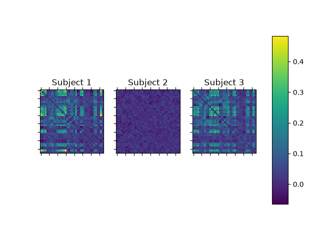
We can now see the off-diagonal structure a bit better. We also see there is a lot of variability between subjects.
Another way we can visualise the network is a glass brain plot. We can do this using the connectivity.save function in osl-dynamics. This function is a wrapper for the nilearn function plot_connectome. Let’s use connectivity.save to plot the first subject’s AEC network.
from osl_dynamics.analysis import connectivity
connectivity.save(
aec[0],
parcellation_file="atlas-Giles_nparc-38_space-MNI_res-8x8x8.nii.gz",
)

Saving images: 0%| | 0/1 [00:00<?, ?it/s]
Saving images: 100%|██████████| 1/1 [00:01<00:00, 1.82s/it]
Saving images: 100%|██████████| 1/1 [00:01<00:00, 1.82s/it]
If we wanted to save the plot to an image file we could pass the filename argument. If we wanted to pass any arguments to nilearn’s plot_connectome function, we could use the plot_kwargs argument. Let’s pass some extra arguments to plot_connectome to adjust the color bar and color map.
connectivity.save(
aec[0],
parcellation_file="atlas-Giles_nparc-38_space-MNI_res-8x8x8.nii.gz",
plot_kwargs={"edge_vmin": 0, "edge_vmax": 0.4, "edge_cmap": "Reds"},
)

Saving images: 0%| | 0/1 [00:00<?, ?it/s]
Saving images: 100%|██████████| 1/1 [00:02<00:00, 2.09s/it]
Saving images: 100%|██████████| 1/1 [00:02<00:00, 2.09s/it]
In the above plot we see every pairwise connection. Often, we’re just interested in the strongest connections - this helps us to avoid interpreting connections that are simply due to noise. Next, let’s see how we threshold the networks.
Thresholding networks by specifying a percentile#
We can use the connectivity.threshold function in osl-dynamics to select the strongest connections. The easiest way to threshold is to pass the percentile argument, let’s select the top 5% of connections.
thres_aec = connectivity.threshold(aec, percentile=95)
Note, connectivity.threshold acts on the connectivity matrix from each subject separately.
Subject-specific networks#
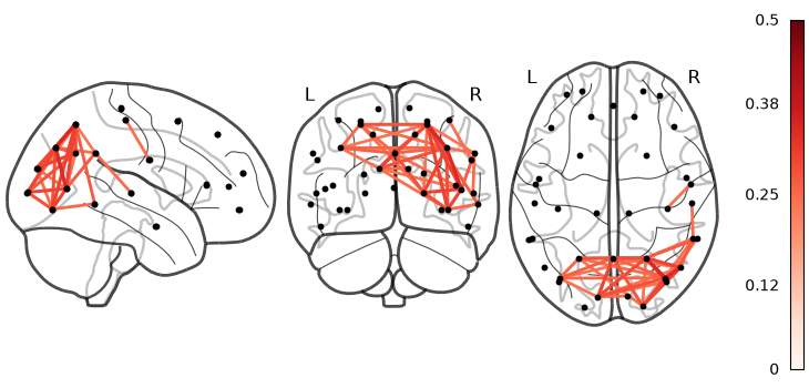
Next, let’s plot the AEC network for the first 3 subjects, thresholding the top 5%.
# Keep the top 5% of connections
thres_aec = connectivity.threshold(aec, percentile=95)
# Plot
connectivity.save(
thres_aec[:3],
parcellation_file="atlas-Giles_nparc-38_space-MNI_res-8x8x8.nii.gz",
plot_kwargs={"edge_vmin": 0, "edge_vmax": 0.5, "edge_cmap": "Reds"},
)


Saving images: 0%| | 0/3 [00:00<?, ?it/s]
Saving images: 33%|███▎ | 1/3 [00:00<00:00, 2.24it/s]
Saving images: 67%|██████▋ | 2/3 [00:01<00:00, 1.62it/s]
Saving images: 100%|██████████| 3/3 [00:01<00:00, 1.88it/s]
Saving images: 100%|██████████| 3/3 [00:01<00:00, 1.86it/s]
We see there is some structure in the networks. We also observed there is significant subject-to-subject variation.
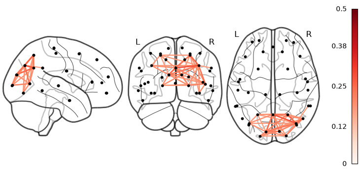
Group averaged networks#
Estimating subject-specific connectivity networks is often very noisy. Cleaner networks come out when we average over groups as this removes noise. Let’s plot the group average AEC network.
# Average over the group
group_aec = np.mean(aec, axis=0)
# Keep the top 5% of connections
thres_group_aec = connectivity.threshold(group_aec, percentile=95)
# Plot
connectivity.save(
thres_group_aec,
parcellation_file="atlas-Giles_nparc-38_space-MNI_res-8x8x8.nii.gz",
plot_kwargs={"edge_vmin": 0, "edge_vmax": 0.5, "edge_cmap": "Reds"},
)
Saving images: 0%| | 0/1 [00:00<?, ?it/s]
Saving images: 100%|██████████| 1/1 [00:00<00:00, 1.41it/s]
Saving images: 100%|██████████| 1/1 [00:00<00:00, 1.41it/s]
Note, we can also plot an AEC network as a 3D glass brain plot using connectivity.save_interactive.
# Display the network
connectivity.save_interactive(
thres_group_aec,
parcellation_file="atlas-Giles_nparc-38_space-MNI_res-8x8x8.nii.gz",
)
Saving images: 0%| | 0/1 [00:00<?, ?it/s]
Saving images: 0%| | 0/1 [00:00<?, ?it/s]
We can see from the above plot averaging over a large group gives us a cleaner network. This is simply due to the data being noisy which makes estimating networks hard. Averaging over subjects helps remove this noise. In the group average network we can see the strongest connections are in posterior regions as expected.
Data-driven thresholding#
Another option is rather than specifying a percentile by hand, we can use a Gaussian Mixture Model (GMM) fit with two components (an ‘on’ and an ‘off’ component) to determine a threshold for selecting connections. The way this works is we fit two Gaussians to the distribution of connections. To understand this, let’s first examine the distribution of connections.
import matplotlib.pyplot as plt
def plot_dist(values):
"""Plots a histogram."""
fig, ax = plt.subplots()
n, bins, patches = ax.hist(values.flatten(), bins=50, histtype="step")
ax.set_xlabel("AEC")
ax.set_ylabel("Number of edges")
# Plot distribution of connections
plot_dist(group_aec)
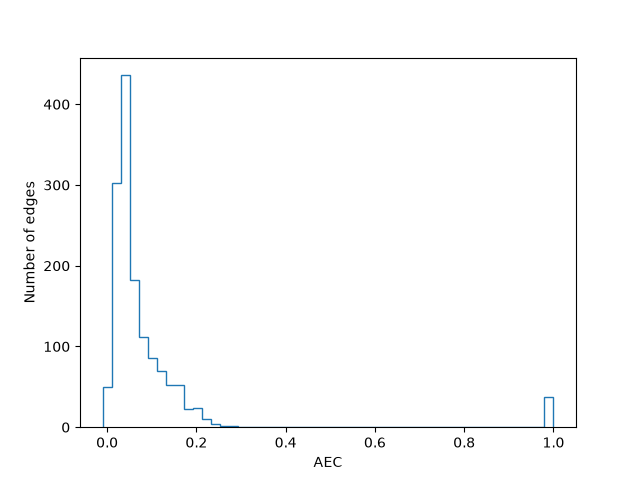
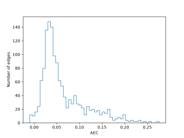
We see there is a cluster of connections between AEC=0 and 0.4 and another at AEC=1. The AEC=1 connections are on the diagonal of the connectivity matrix. Let’s remove these to examine the distribution of off-diagonal elements, which is what we’re interested in.
# Fill diagonal with nan values
# (nan is preferred to zeros because a zeo value will be included in the distribution, nans won't)
np.fill_diagonal(group_aec, np.nan)
# Note, np.fill_diagonal alters the group_aec array in place,
# i.e. we don't need to do aec_mean = np.fill_diagonal(aec_mean, np.nan)
# Plot distribution of connections
plot_dist(group_aec)
We can see there is a peak around AEC=0.05 and a long tail for higher values. We want the connections around the AEC=0.05 peak to be captured by a Gaussian and the long tail to be captured by another Gaussian. Let’s fit a two component Gaussian to this distribution. Fortunately, osl-dynamics has a function to do this for us: analysis.connectivity.fit_gmm. This function returns the threshold (as a percentile) that determines the Gaussian component a connection belongs to.
# Fit a two-component Gaussian mixture model to the connectivity matrix
percentile = connectivity.fit_gmm(group_aec, show=True)
print("Percentile:", percentile)
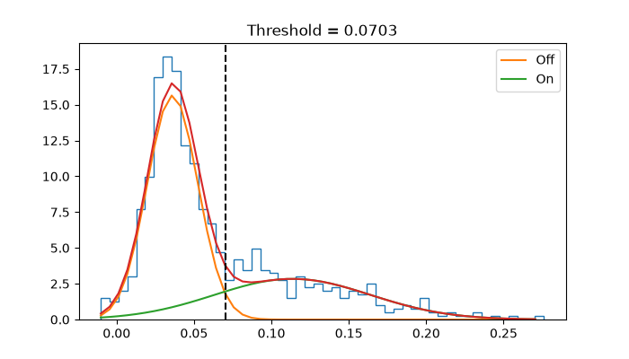
Percentile: 68.9900426742532
Let’s now use the data-driven threshold to select connections in our network.
# Threshold
thres_group_aec = connectivity.threshold(group_aec, percentile=percentile)
# Display the network
connectivity.save_interactive(
thres_group_aec,
parcellation_file="atlas-Giles_nparc-38_space-MNI_res-8x8x8.nii.gz",
plot_kwargs={"edge_cmap": "Reds", "symmetric_cmap": False},
)
Saving images: 0%| | 0/1 [00:00<?, ?it/s]
Saving images: 0%| | 0/1 [00:00<?, ?it/s]
We can a lot more connections now. We can be more extreme with the connections we choose by enforcing the likelihood a of a connection belonging to the ‘off’ component is below a certain p-value. For example, if we wanted to show the connections belonging to the ‘on’ GMM component, that had a likelihood of less than 0.01 of belonging to the ‘off’ component, we could do the following:
# Fit a two-component Gaussian mixture model to the connectivity matrix
# ensuring the threshold is beyond a p-value of 0.01 of belonging to the off component
percentile = connectivity.fit_gmm(group_aec, p_value=0.01, show=True)
print("Percentile:", percentile)
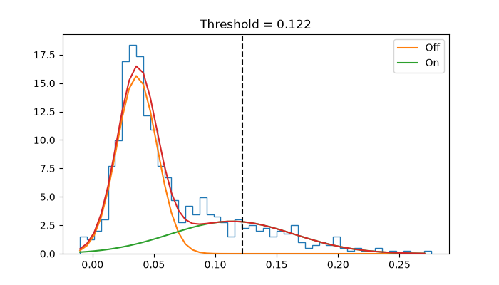
Percentile: 85.77524893314367
We can see the threshold has moved much more to the right now. Let’s example the network with this threshold.
# Threshold
thres_group_aec = connectivity.threshold(group_aec, percentile=percentile)
# Display the network
connectivity.save_interactive(
thres_group_aec,
parcellation_file="atlas-Giles_nparc-38_space-MNI_res-8x8x8.nii.gz",
plot_kwargs={"edge_cmap": "Reds", "symmetric_cmap": False},
)
Saving images: 0%| | 0/1 [00:00<?, ?it/s]
Saving images: 0%| | 0/1 [00:00<?, ?it/s]
Note, osl-dynamics has a wrapper function to return the thresholded network directly (so you don’t need to threshold yourself): connectivity.gmm_threshold. Using this function, we can threshold connectivity matrix in one line:
thres_aec_mean = connectivity.gmm_threshold(aec_mean, p_value=0.01)
Total running time of the script: (0 minutes 19.700 seconds)